Some people (1, 2, 3, 4) have made hay out of data showing total health spending in the United States is heavily concentrated on a small fraction of the population:

source
My intuition and knowledge of the health care industry has long led me believe this likely not too dissimilar from what goes on in other developed countries (the young and/or reasonably healthy simply do not need or want much in the way of health care). If nothing else it seems unreasonable to use this data to argue the US is an outlier without at least going through the exercise of comparing it to other countries. Unfortunately the OECD and related entities provide little in the way of public data along these lines, so I have not been able to do this analysis myself.
However, I recently stumbled across a blog post from IFS regarding a study they published that speaks directly to these and related topics, so I thought I would briefly share this and related information in a quick-and-dirty blog post (full-text copy here).
Concentration of spending amongst all individuals

Top 10 percent of spender share of total health expenditures:
- US: 50-70%
- France: 50-70%
- Denmark: 65-80%
- Japan: 65-80%
- Netherlands: 65-80%
I would much prefer more and more specific figures, methods, etc, but the US certainly does not look like an outlier here!
some additional research on this topic….
This paper also suggests that hospital spending (both inpatient and outpatient) is also highly concentrated in England (which is very much “single payer” with mostly very much state-run hospitals).

These slides discuss the concentration of health expenditures in Ontario Canada (and this paper provides some more details)

Ontario top 10% spenders = ~79% of total health expenditures (in 2007)
The data I have found rather strongly suggests the patterns of US concentration of NHE is broadly in the same ballpark as the rest of the developed world.
These patterns have evolved over the past few decades:

source
Spending in last year of life
Their data also suggests US does not spend vastly more on end of life care than the rest:


This information flies in the face of many claims that end-of-life care accounts for the lions share of spending in the US at just ~5% of total health spending.
This 65+ US estimate is also consistent with estimates produced by others and that the (ex post) last-year-of-life population only account for about 11% of the high cost population too.

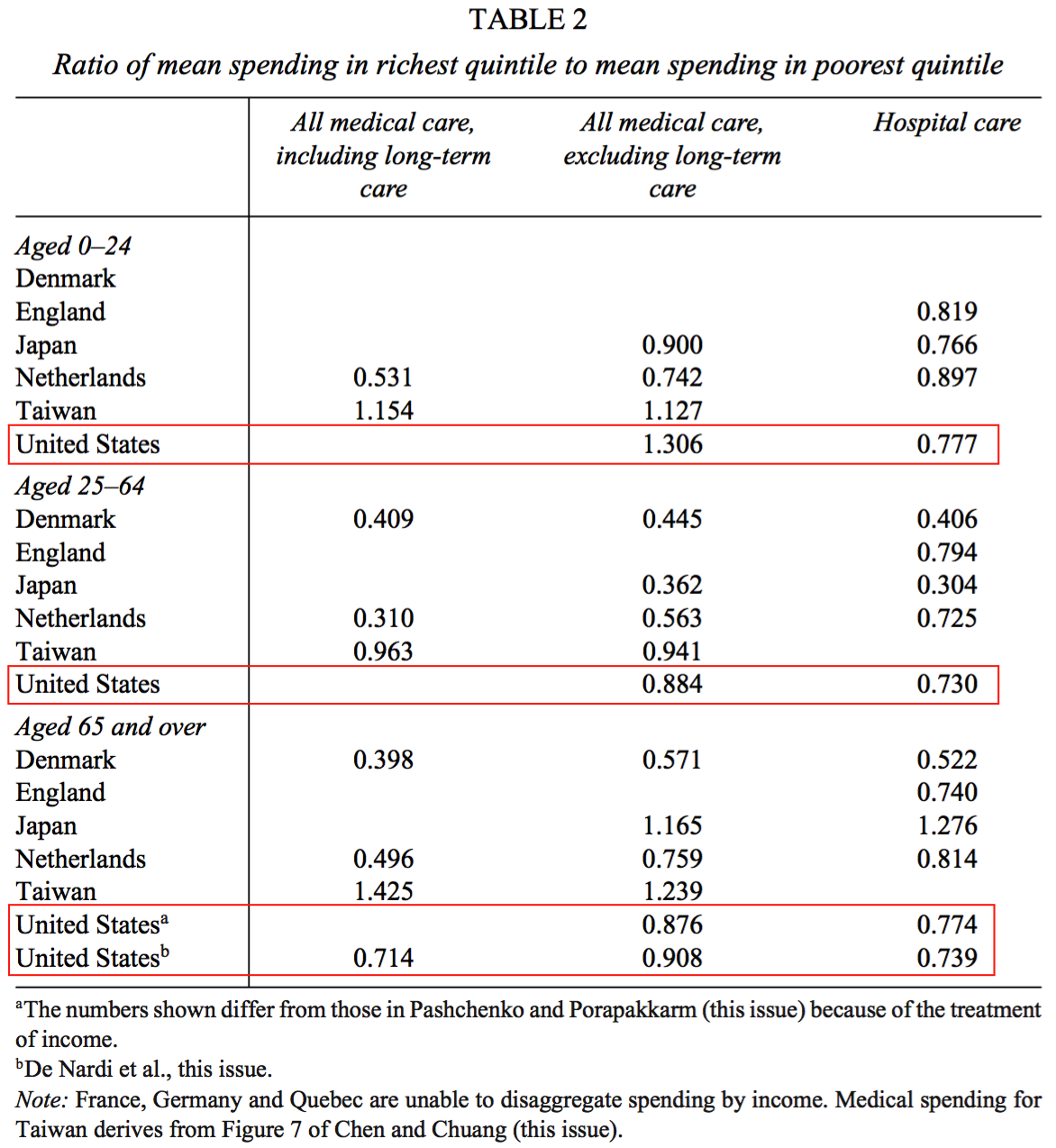
Spending by income
They also provide some additional data on differences in average spending by income.

Except for the 0-24 year old population, total spending (excluding LTC) is actually higher for the poorest group in the US, as it is in most other countries, and it is higher across all other categories too (all hospital & total including LTC).
Again, this is consistent with other findings with respect to income and health expenditures in the US:

And it’s generally consistent with studies on individual income elasticity.
For the most part the US health system looks much more like the rest of the developed world than many people seem to believe.
More specifically the data suggest:
- NHE is (probably) heavily skewed in most of the developed world and US looks to be in the same ballpark.
- Last year-of-life accounts for a relatively modest fraction of NHE in the US and most other developed countries (5-10% of NHE) and probably explains very little of the skewness in overall NHE.
- There is substantial redistribution in health spending in developed countries. Even in the US individual income is a fairly poor predictor of health expenditures and it’s often inversely associated with health expenditures (the poor tend to be sicker and the reasons probably have relatively little to do with inequities in the health system).