Austin Frakt and Aaron Carroll recently wrote a piece for the New York Times re-hashing Uwe Reinhardt’s fifteen-year-old argument (“It’s The Prices, Stupid”) that high prices explain why US healthcare spends so much more than other countries.
(Shhh, it’s the prices.) | Why the U.S. Spends So Much More Than Other Nations on Health Care https://t.co/qrGyiXUsnr
— Austin Frakt (@afrakt) January 2, 2018
Reinhardt’s argument was never well founded, and FC did not substantively advance it.
I have previously shown that comprehensive measures of mean household disposable income and consumption are superior predictors of current health expenditures (HCE); that US households are unusually affluent; and that this adequately explains US health spending cross-sectionally and its change domestically (and relative to the rest of the OECD starting from at least the 70s). Changes in household income levels are the root cause of almost all spending increase.
I have also shown that healthcare prices are not likely to be the proximate cause of high US spending in cross-sectional or times series analyses (especially not in the past several decades). Contrary to the arguments made by Reinhardt and many others, the long-term rise in HCE relative to income in the US, as in other developed countries, has little to do with excess health inflation (over-and-above the rate of general inflation) and almost everything to do with rising volumes of health care consumed.
Review
Before I begin rebutting FC’s specific claims, I will briefly review some of the highlights from my earlier blog posts on the role of health prices.
Point I
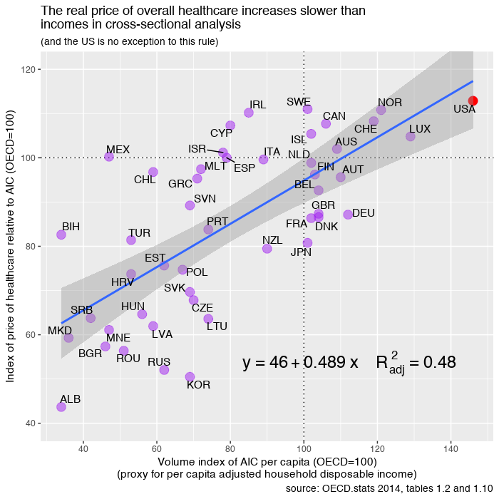
Adjusting for international health prices with OECD’s health PPPs (the best available international health price data), US consumed ~110% more than the OECD average in 2015 according to the OECD’s own methodology (similar results are also obtained for 2014, 2011, and 2008 on OECD.stats — see table 1.10)

Point II
The OECD health PPP researchers preferred method of illustrating relative health prices indicate the US hospital prices (surgical procedures) is actually substantially below trend (though they tend to omit this point)

source

source
Due to the mismatch between exchange rates and domestic purchasing power, as indicated by PPPs, US healthcare appears to be far cheaper than it really is.
Point III
A much more sensible way of illustrating prices is to just divide the published health or (narrower) hospital services PPPs by the PPPs for GDP or AIC. This provides a decent measure of relative differences in domestic opportunity cost (i.e., how much real consumption is foregone when buying a comparable bundle of health care in a given country as compared to the OECD average) and is a better indicator of prevailing health prices as most people would think of it. This method typically shows the US close to trend (not far below the trend as it is with PLI )


What you do not see here is a sizeable positive residual for the US that would suggest the US’s high health expenditures are being absorbed by idiosyncratically high health prices.
Point IV
Although deflating HCE by the latest health PPPs instead of more conventional economy-wide PPPs does slightly reduce the implied HCE volumes for high-income countries, it nonetheless still increases markedly faster than incomes, yields similar positioning, and shows the US to be close-to-trend.

Point V
The cross-sectional evidence suggests that even if the real rate of health inflation were precisely zero, the HCE share of income would increase because the real volume of health consumed per capita handsomely exceeds the real rate of income growth (elasticity much higher than one).

Point VI
The human health share of total employment also explains a fair amount of the variance in the HCE share of GDP and the US, unsurprisingly, has a proportionally larger health workforce.

And the US health workforce share has clearly grown tremendously over the past several decades.

Point VII
While overall health inflation has clearly exceeded the rate of general inflation in the long run (like we observe in cross-sectional data), all of the major domestic health price indices suggest that health inflation has not exceeded the rate of income growth over the past several decades.

If these price indices are reasonably accurate indicators of overall price levels (and I think they are), then price alone explains none of the long-run increase relative to GDP or disposable personal income. In other words, if volume per capita had remained constant the HCE share of GDP (or DPI) should have fallen over this period.
Point VIII
This is also consistent with the BEA’s quantity indices (i.e., it’s not just my idiosyncratic interpretation)

Point IX
This is consistent with more focused studies on the role of prices and quantities on real domestic HCE growth.
Point X
It is the consensus view amongst researchers that have published long-run analyses:

Point XI
Some excess medical inflation is to be expected domestically given Baumol’s cost disease and evidence from other countries, ergo the mere existence of excess health inflation (especially in a narrow labor-intensive sub-category) cannot be a strongly attributed to idiosyncracies in the US health care system.
That cost disease is a real and pervasive phenomenon that extends far beyond US healthcare is the consensus view of economists.

As broader economic productivity increases, prevailing wages increase, and some of these gains inevitably translate into somewhat higher prices and higher wages in healthcare (increases about 60% as fast according to this central estimate) and other industries (notably including those that aren’t necessarily the originators of strong productivity gains)

Analysts have found similar effects throughout the OECD (“relative price” being excess health inflation)

Health inflation usually exceeds the rate of overall inflation throughout the OECD (especially when real incomes are rising), but health inflation increases slower than nominal income growth on average. The vast majority of inflation-adjusted per capita health expenditure growth has been driven by increasing per capita volumes (quantities).
Rebuttal
Now I will rebut the claims Frakt and Carroll made in their NYTimes article.
Part I
“The study, also written by Gerard Anderson, Peter Hussey and Varduhi Petrosyan, found that people in the United States typically use about the same amount of health care as people in other wealthy countries do”
What they fail to mention is that the same crude utilization indicators proffered by this group (and others like it) explains approximately none of the variance between countries, some even have the wrong sign, and none of them are nearly quantitatively significant enough to explain why some of these very same countries spend so much more than others, not in real per capita terms or as a share of income.
Why should we expect US HCE to be well explained by these factors when high spending in other high-income countries is terribly explained by these same indicators? Either this data is garbage with little real relationship to health system encounters (or utilization) or, more likely, their mental model for what drives health spending higher is inaccurate (“it’s mostly the intensity, stupid”).
For instance, doctor consultations per capita has no explanatory value here.

Likewise for curative care discharges:

Inpatient discharges are infinitesimally better, but it’s not even statistically significant despite the fact that many of these countries spend 2-3 times as much in relative and absolute terms.

Factoring in length of stay (bed-days) doesn’t improve this either:

Further analyzing these conventional utilization metrics in multiple regression does not change this picture. If one presumes developed countries have broadly comparable disease burdens (i.e., not wildly different needs per encounter) and that these crude utilization indicators measures are reasonably accurate, then utilization explains approximately nothing — not nearly enough to credibly claim the US is an outlier that must be explained by idiosyncratically high prices. This also implies that age, disease, and different propensities to seek healthcare are unlikely to significantly explain why real HCE increases sharply with increases in material living conditions (whether measured by income or consumption). In other words, while country encounter rates may vary significantly, it’s mainly idiosyncratic and orthogonal to the increase in HCE and material living conditions.
Part II
“A recent study in JAMA by scholars from the Institute for Health Metrics and Evaluation in Seattle and the U.C.L.A. David Geffen School of Medicine also points to prices as a likely culprit. Their study spanned 1996 to 2013 and analyzed U.S. personal health spending by the size of the population; its age; and the amount of disease present in it.”
The study, Dieleman et al., did not analyze prices and the authors made no such claims in the paper. What they did is decompose the change in their spending data into five factors:

What they call “price and intensity” accounts for most of the increase, but it is little more than average spending per encounter.

All this tells us is that the number of encounters (partially a function of population growth, aging, and disease burden) and the case mix (as measured) explains less than half the increase over this period.
Moreover, the “price and intensity” is fairly crude:

It takes no account of changes in diagnostics, preventative care, therapies, and so on. According to this method, a doctor spending 10 minutes with a patient and (proverbially) telling him “take two aspirin and call me in the morning” is indistinguishable from an encounter in the more modern context wherein much more is apt to done (especially outside of the primary care context). Likewise, shorter hospital stays (clearly the trend throughout the developed world) will tend to show in this bed-day method as increased “price and intensity” even if the total remained constant!
As in several other studies, what they have deceptively reduced to “price” for public consumption is, in fact, thoroughly commingled with intensity factors, meaning we cannot use it to make valid inferences about the role of rising health prices in health expenditure growth.
Part III
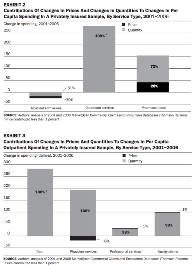
“For example, one study found that the spending growth for treating patients between 2003 and 2007 is almost entirely because of a growth in prices, with little contribution from growth in the quantity of treatment services provided.”
This paper is somewhat similar to Dieleman at al in design, albeit with actual service price disaggregation, but FC’s summary of this research is misleading. Of the 28% nominal increase in expenditures between 2003 and 2007, ~12.9% is attributable to general inflation, leaving 15.1% to be explained by excess health inflation and everything else (utilization, intensity, etc.).


By Dunn et al.’s estimate, excess health inflation explained just ~4% of the real growth in this period. This means that excess health inflation explained only ~26% of the real increase in expenditures (a far cry from “almost entirely because of a growth in prices“). They say as much explicitly:

Moreover, their estimated 4 percent excess health inflation is consistent with excess inflation estimated from broader price indices over the past several decades and, especially, over this particular period. For instance, the PCE health index increased by 14 percent and PHC increased by 13.5 percent in the same period — right in the ballpark of their ~15.9% SPI growth (given differences in scope, aggregation methods, etc., not to mention the short time span, some variation is to be expected).
Also worth mentioning: the increase in all of these health price indices were less than the nominal growth in GDP per capita (21.1%), DPI per capita (19.3%), and Personal Consumption Expenditures per capita (20.9%) over this same period. In other words, measured health inflation explains none of the HCE growth in spending relative to income or consumption here either (nominal HCE per capita increased by 25% nationally over the same period).
Part IV
“Another study found that U.S. hospital prices are 60 percent higher than those in Europe.”
The data and methods in this paper are sound (it’s a pilot study for the OECD health PPP series — which I’ve referenced extensively), but EC miss some important points. The estimated 60 percent refers to the average for any OECD countries for which they could produce data (not just Europe). Those countries skewed lower-income (e.g., Korea, Slovenia, Israel) and included relatively few observations for other high-income countries (e.g., Switzerland, Luxembourg, Norway) so that the mean income level for each service category was much lower than the US.
This is highly relevant because the price level for hospital services (surgical procedures) are theoretically and empirically much more closely linked to income levels than the broader health price levels due to the general health sector’s exposure to tradable goods, which helps to suppress the linkage between domestic income levels and overall health prices.

[an elasticity of one implies that a 10% increase in real income (or consumption) predicts a 10% increase in the real price of hospital services]
The real per capita income of US households in 2007 was also, not coincidentally, between 50 and 70 percent higher than the other countries with available prices (depending on the specific procedure).
If we took a similarly naive approach to education spending with a similar range of countries we’d very likely determine the price of US secondary school education is much higher than the sampled average (which is mostly a function of differences in income levels and the US isn’t even the most expensive).

If we actually plot the PPP-adjusted quasi-prices from the paper for procedures that include observations for somewhat comparable countries, the US is about where its income would predict it to be.

While the granular quasi-prices available in this paper are interesting to peruse, the methods used in this document are the foundations from which the latest health and hospital services PPPs were formed. Estimates from newer quasi-price data with more refined methods exist in the form of PPPs, PLIs, and similar indices in the OECD’s and Eurostat’s PPP benchmark data. These PPPs are little more than a weighted average of quasi-prices of the sort discussed in the working paper. The official PPP series cover the entire OECD; are likely more reliable (further refinements), and allow us to readily compared the weighted average price. This more up-to-date data clearly shows the US does not have inexplicably high average prices for hospital services.
Since I plotted relative AIC at the start of this post, which some people might quibble with, I’ll do this relative to GDP and GDP PPPs this time around:

While US hospital services probably are roughly 60% above the OECD mean, this is apparently very much of function of income. Similar hospital service prices are typically found in countries with comparable income levels. However, due to offsetting effects on non-hospital services health prices, the actual average price increase for the entire sector is markedly less.
Part V
“Other studies also point to prices as a major factor in American health care spending growth.”
The first paper, Moses et al., is not useful. It apparently relies substantially on the Medical CPI, which is known to dramatically overstate overall health inflation (not its intended use), and the analysis hinges entirely on this widely available price index (it’s not a primary source for price or quantity estimates).
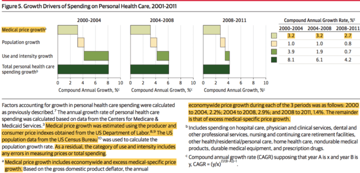
However, even if we take these estimates as gospel, they’re quoted as nominal price inflation, not excess health inflation. If we use the provided GDP deflators this implies that average (CAGR) excess price growth in 2000-2004, 2004-2008, and 2008-2011 were 1.0, 0.3, and 1.3 percent respectively. This means excess medical inflation had a compound annual growth rate of less than 1% per year between 2000 and 2011 by my back of the napkin arithmetic.
The second paper, Spiro et al., is mostly a review of prior arguments, the pro-price (or anti-utilization/intensity) arguments which I’ve already addressed quite well here, so I’ll not spend much time with it. I will, however, point out that even they acknowledge that non-price factors (“utilization”) are likely highly significantly.
For instance, Spiro et al. acknowledge some other available OECD indicators indicates markedly higher US intensity (which I’ve also shown):

They also show this plot of nominal HCE growth which suggests excess health inflation explains only a modest fraction of the long-run increase.

And they acknowledge this CBO publication which points out that the consensus view of researchers is that excess health inflation explains less than 20% of the real increase in HCE.
Let’s hear it directly from the CBO report:

This same CBO paper goes on to point out that technological change in medical practice (which is likely to show up as “intensity”) is believed to account for the most of the real growth.

Spiro et al. also cite research shows that prices, disease burden, etc explain less than half of the considerable regional variation in spending observed in the US.

This has been studied further. Adjusting for prices alone changes little (prices explain little of the variance).

Price explains little of the long-run inflation-adjusted increase in HCE domestically; little of the cross-sectional difference; and little of the variance within the US (which is quite well associated with state and regional income levels). The weight of the evidence quite clearly demonstrates excess health price plays a minimal role in the overall long-run increase domestically and the cross-sectional difference between countries. Changes in technology, intensity, and the related concepts, on the other hand, appear to be highly explanatory and track rather well with income levels (not to mention various other inputs and proxies for it).
Conclusion
Although price inflation is a substantial factor in nominal terms, excess health inflation across the entire sector has been relatively modest and less than real income growth over the past couple of decades. The increase in real health expenditure per capita is best explained by rising volumes or quantities of health care consumed per capita. The evidence suggests the lions share of the volume increase is through rising intensity on a per encounter basis, as opposed to increasing number of health system encounters or a change in the mix of encounters (often called “utilization”).
Much more is likely to be done today as compared to twenty or thirty years prior, given an otherwise identical encounter (as in, same patient characteristics, disease, severity, symptoms, etc), and our willingness and ability to do more (“intensity”) is ultimately a result of real increases in the material standard of living of the average household. When I say intensity I mean increased quantity and quality (more cutting edge, more resource intensive, etc) of preventative care, diagnostics, therapies, surgical procedures, prescription drugs, medical devices, and so on and so forth, relatively little of which will show up as utilization as it is often measured. The domestic time series and international (cross-sectional and panel) data are all quite consistent in this regard.
Here is a decomposition of the changes using official CMS expenditure and price index elements (Table 23 of their historical tables)

You might notice excess medical inflation for the total PHC category is below the volumes for both income measures. Excess Hospital Care inflation roughly matches real income growth (which is consistent with cross-sectional evidence) but is offset by the slower increase in several other sub-sectors (e.g., physician and clinical services, DME, other medical equipment, etc.). Overall CMS’s estimates suggest excess health inflation in these sub-categories rarely significantly exceeds the real rate of income growth. Instead, most of these categories show very substantial volume growth (quantities), usually well in excess of real income growth.
CMS also reports inflation estimates for other non-PHC health expenditures like research, public health activities, and so on (though none of them are large enough to decouple PHC from total NHE).

Most of these items also show excess inflation over and above general inflation indices despite fundamentally different market forces (which may be a product of cost disease).
Lastly, I remind you that US health spending is quite well explained by adjusted household disposable income.


In actuality, there is much less to be explained than people think.
I wrote a little about what it looks like when you adjust the per capita household expendable income figure with the Gini index. US costs shoot back up again: https://medium.com/@nslewis/are-high-us-healthcare-costs-just-an-illusion-c6d699c39496
For the benefit of those that may happen across this later, I responded at length to inequality and related objections
Neat analysis that seems to conclude the #1 way to reduce healthcare costs in US is jacking up tax rates. If disposable income sets prices, then gov paid healthcare through large tax increases would be inherently and massively advantaged. Each time they raise taxes to buy care the cost of the same care decreases as disposable income decreases.
Hell, if lowering disposable income lowers healthcare costs we could dynamically score any tax increase to include the additional savings to Medicare and Medicaid.
I guess the only way we will solve healthcare costs being out of line is through taxing 50% of GDP like Northern Europe.
Thank you. It’s not that adjusted disposable income sets prices so much as it determines the amount of health care consumed. Raising taxes is only likely to reduce health spending to the extent it reduces the material living conditions of households. In the long-term, the material living conditions is the primary (some would argue the sole) purpose of having an economy in the first place (work, investment, etc). Reducing our material standard of living to lower health spending is rather like shooting our selves in the foot.
Northern Europe doesn’t spend less on health because they have high taxes per se. They spend less because most of them have substantially lower GDP and/or have other reasons why this GDP does not ultimately show up in household budgets. For example, a high % of Norway’s GDP is temporary income (oil revenues), so they need to engage in substantial consumption smoothing if they don’t want their material standard of living (and other parts of their economy) to plummet when the oil revenues diminish. This only works so long as households aren’t seeing this value add. As they start to spend out of their savings their problem with respect to GDP will be even larger, i.e., their material living conditions will be higher than what other countries would be conditional on GDP (as its predicted at not especially high levels as compared to other advanced economies). Sweden is engaging in some consumption smoothing for somewhat similar reasons (pending demographic bomb + generous welfare state = higher projected outlays), but again this isn’t likely to be a long term solution to health spending either. Then we have oddball countries in NW Europe like Ireland (corporate tax inversions) and Luxembourg (large non-resident workforce) — their material living conditions are quite low conditional on their GDP….
This is less about taxes per se or the distribution of income, then how much money is leaving the country (workforce remuneration, corporate profits, etc) and what sector within the country it’s ending up in (household vs gov’t vs corporations). US has a somewhat high ratio with respect to GDP whereas it’s abnormally low in a small handful of countries and these countries blow up the regressions on GDP since GDP isn’t ultimately what determines health spending.